
RelataLabs / 2026-09-27
Day 1: an audit of RelataLabs mobile navigation
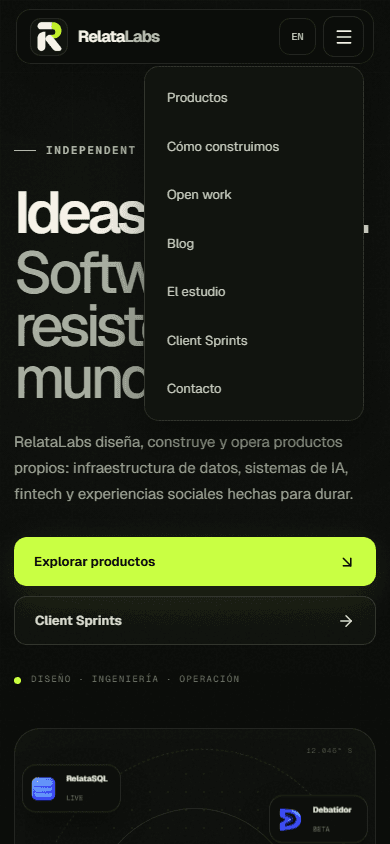
On 27 September 2026 we reviewed the RelataLabs landing code and captured the open menu in a local build at a 390 × 844 pixel viewport. This editorial audit of our own menu does not claim user metrics or field-test results.
Inventory
The mobile menu in Header.tsx contains Products, How we build, Open work, Studio, Client Sprints and Contact. Some destinations lead to home-page sections; others open pages.
Journey
The component uses a details element with links inside nav. The browser journey to check is opening the menu, moving through each link, choosing a destination and returning.
Verifiable observation
Products, How we build, Studio and Contact get their labels from translations; Open work and Client Sprints appear as names in both languages. The language switch sits outside the menu.
Editorial decision
Each label should anticipate its destination. When adding the blog, we add an explicit entry to navigation and footer and keep equivalent routes in both languages.
Next test
The screenshot confirms the menu opens and shows seven destinations at this viewport. It does not prove behaviour on every device; touch and keyboard checks remain acceptance criteria before publication.
Example to adapt
Audit record: date 2026-09-27; object: mobile navigation in relatalabs-landing/src/components/Header.tsx; method: code inspection and a local screenshot with the menu open at 390 × 844 px. The new blog route is included in this review.
Final check
Before publishing: open and close the menu with keyboard and touch; verify all seven destinations after adding Blog; confirm that the ES/EN switch retains the equivalent page.